


Realising ‘Why’
Riweb is almost 10 years old but it was only in the past 12 months or so that the team really started to figure out ‘our why’.
Prior to this, Riweb was pretty much just another web agency, a great one yes but there was nothing more to the company than creating excellent websites for our wonderful clients.
While it may have taken 9 years to identify it, once we discovered our true purpose, we realised it had been obvious all along.
As a team and as individuals, we had been passionately doing more to help our community and the environment than most.
More of a moment of realisation than a process of discovery, we identified that we do what we do to make a positive impact on the world.
Sounds a bit grand for little old Riweb, eh?
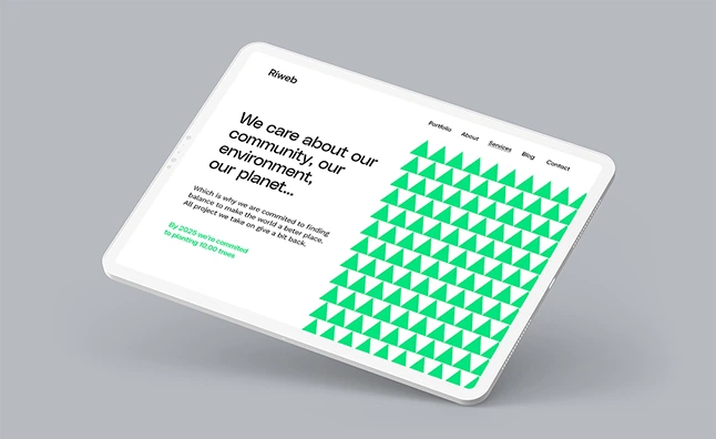
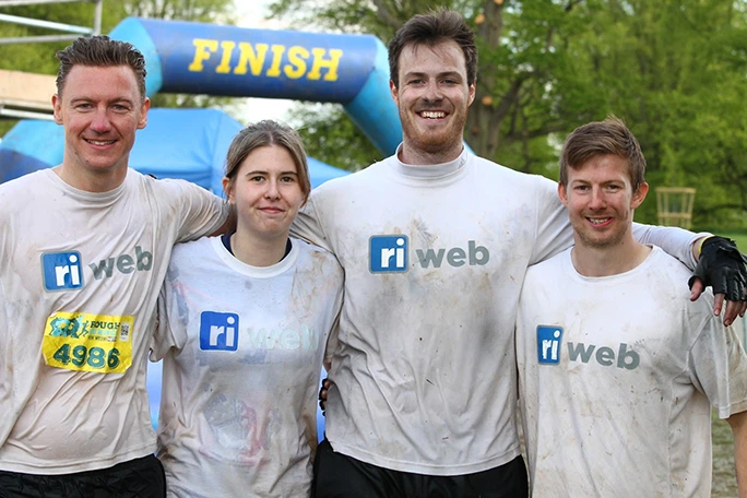
Well, at the time of writing and since the company was established in 2013, the team has raised almost £33,000 for various causes, planted over 9,000 trees and created successful career paths for 6 young people with zero experience in our industry.
And all of this was done almost subconsciously.
This moment of clarity was extremely rejuvenating and with everyone of the team already naturally bought in, the values were already there.
But where was this communicated externally? Does our messaging and branding clearly communicate this?
Your Company Branding is More Than a Logo
Throughout the history of Riweb, we’ve never really done our branding properly.
It’s always just been a case of changing the company logo when we felt it was outdated or we were simply bored of it.
Plus, a proper branding exercise is expensive, right?
Well, like most things, it turns out that you get what you pay for!
Having identified that our current brand no longer fit the company, we got to work on upgrading ‘Ri Web’ to ‘Riweb’.
What’s in a name?
The name ‘Ri Web’ was conceived when I, Ryan Irving, started my web design business with very modest ambitions in 2013.
Since then, the company has grown way beyond me personally and I cringe when I have to explain our name.
I feel it makes us look small and perhaps like I’m a one man band. I also worry how the team feels working for a company named after me.
As a result of these frustrations, we’ve been through a few attempted name changes through the years but nothing has ever stuck/worked.
When I raised all of this with Craig, our branding expert, he explained that this crap was just in my head and most people probably aren’t giving it that much thought.
Given that the company is almost 10 years old, there is some value in the existing name not to mention the SEO we’ve built up in the domain name.
With this in mind, he offered a very simple but effective solution; remove the space.
By combining it into one word, it removes the emphasis on the initials.
But what does ‘Riweb’ mean? Nothing. What does ‘Google’ mean?
The major lesson I took from this experience is that nobody cares anywhere as much about your company name as you do.
This also applies to logos…
Nobody Cares About Your Logo
More ego-shattering revelations from Craig!
Unless you’re Coca-Cola, Apple or Ford, nobody is paying much attention to your logo and they’re also unlikely to remember it.
Can you think of any small business logos off the top of your head?
So the approach to creating the new logo was more about what Riweb stands for than fancy fonts and icons.
Know Thyself
In order to produce new branding that not only accurately represents us now, but is also future-proofed, we need to first get crystal clear on a few things…
- What’s the plan for the next 5,10,20 years
- What makes us different
- What’s our ‘why’
- Who is our target audience
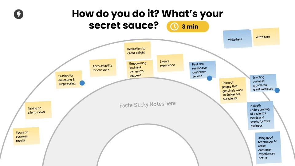
Despite being the owner of the business, these team sessions were both enlightening and energising.
When asked about our plans for the future, seeing responses like ‘Significant contributors to global change’ and ‘Raised £1m for charity’ felt wonderful.
Again, it was clear just how aligned the team was on making a positive impact.
Another standout was the responses to ‘What makes us different’ which included:
- ‘Passion for educating & empowering’
- ‘Fast and responsive customer service’
- ‘Enabling business growth via great websites’
Finally, who do serve? This was harder to answer.
Riweb doesn’t have an industry niche target market. In addition, our portfolio of previous work is wildly varied.
But something does connect our client base that again, validated our thoughts.
Most of our existing clients shared these traits:
- Good values
- Ambitious for growth
- Appreciation for ongoing digital advice
Everything was falling into place nicely. As a team we are both aligned and clear on why we do what we do, who for and how we do it.
Introducing Riweb 2.0
We operate in a digital world full of technical terms, acronyms new technologies.
But this is not our client’s world and it’s always been important to us that we communicate clearly.
This, combined with some of our previous learnings created the framework for our new branding:
- Simplicity
- Variation in client size / industry
- Focus on positive global impact
Shaping the New Concept
Our clients and their businesses are unique. They come in all shapes and sizes and we’re here to help them no matter their goal.
Riweb websites are bespoke, to fit the different clients we have.
No square pegs in round holes.
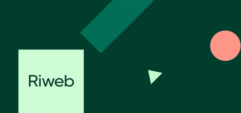
Adding Some Colour
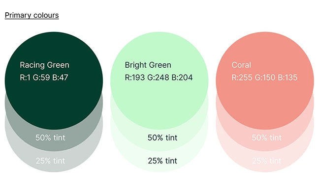
Historically, shades of blue have always represented Riweb.
But this is Riweb 2.0 and we’re laser-focused on helping the planet.
We create green websites.
Bringing It All Together
Ri Web has become Riweb.
What was blue is now green.
From no concept to utilising shapes.
The end result it not only right on point for representing our company but is also modern, stylish and unique.
It subtly represents the people we hope to work with and puts our ‘why’ front and centre.