


I browse recruitment websites on a daily basis and there are plenty of common mistakes I see all the time.
Not opening external links in a new tab, promoting social media links too much and using a carousel/slider are a few examples.
But there is something else I see a lot of that I want to discuss today and that’s the 2 buttons or links used to try and split an audience into two distinct categories:
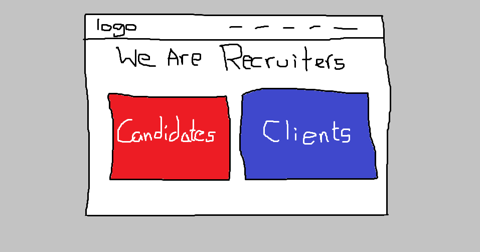
I understand the mentality behind it, you want to get your prospects to see the content that you’ve created for them and similarly get candidates looking at theirs.
There are a couple of issues with this approach.
Does someone looking for a career change see themselves as a ‘candidate’?
It’s the standard description within the recruitment industry, used by recruiters all the time but do the very people you’re trying to entice, refer to themselves as a ‘candidate’?
I’m not sure they do.
Alright Ryan, so what else do we call them?!
The point I want to make here is that anyone who visits your website is simply a person with a different objective to the next.
Pigeonholing your website visitors into two specific categories is bad practice.
Someone who you might refer to as a ‘candidate’ could be looking to achieve any of the following objectives on your website:
- Browse available roles
- Register with your agency
- Sign-up for notifications of new vacancies
- Find your telephone number
- Sign-in to their online account
- Find out more about your agency in general
- Refer your services to a friend
- Apply for a role
- Find the email address of their recruitment consultant
- Get advice for an upcoming interview
- Browse your blog
- Get your address
This is not an exhaustive list but you can easily see why forcing a ‘candidate’ to look at one particular area of your website is creating a poor user experience for many.
The same can be said for clients.
A new business prospect is not a ‘client’
When a new prospect browses your recruitment website, they’re not yet a client so why would they click a big button that says ‘Clients’ on it?
It’s reasonable for them to suspect that big button is for existing clients and not themselves.
With this in mind, why on earth would you make it so confusing for someone to show their interest in working with you?
Like with potential candidates, we need to consider more of their individual objectives when browsing your website e.g.
- Browse the types of roles you recruit for
- Make an enquiry
- Subscribe to your newsletter
- Find your telephone number
- Sign-in to their online account
- Find out more about your agency in general
- Understand what your process is
- List a new vacancy
- Find the email address of their account manager
- Browse your blog
- Get your address
Again, this is not an exhaustive list but demonstrates the variety in the objectives of someone browsing your website who may be interested in working with you.
Now that we understand more about the varying goals of someone who visits your website, we can create much more relevant calls to action that your website visitors will want to engage with.
How you can appeal directly to both ‘candidates’ and ‘clients’
In-depth planning should have been completed at the start of creating your website but if you have an existing website, you can still deliver a better user experience by brainstorming the potential objectives of your website visitors.
I’ve even given you a head-start with the 2 lists above!
Once you know your website visitors’ objectives, you simply need to cater to them.
You can do this by creating content (pages/blogs) that solves your visitors’ objectives and calls to action (buttons/links) to drive them to it.
By taking the time to put yourself in your target market’s shoes, you will deliver an experience on your website where both potential ‘clients’ and ‘candidates’ feel like they’re in the right place specifically for them.
Great user experiences will deliver higher conversion rates so ensure you invest the time in creating the best possible experience on your own recruitment website.